In previous versions of Foam, bubble colours were set individually. This made it hard to make changes consistently and tedious to update large foams. Now every bubble has a style and changes to the style will be propagated across all bubbles that use that style (unless they already override some of the style's settings). Styles are stored in text files, just like foams, so you can easily move them to another machine or share them.
Styles are managed from the Appearance Section of the Bubble Configuration dialog. Ctrl-click on a bubble to show the dialog open the Appearance panel if necessary:

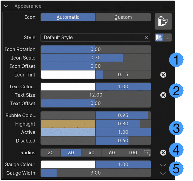
The lower part of the panel deals with styles. There is a search box for you to find a style you want to use ![]() . New bubbles or bubbles created in previous versions will use the Default Style. This and other styles that come with Foam can't be changed. But you can use them to create your own styles.
. New bubbles or bubbles created in previous versions will use the Default Style. This and other styles that come with Foam can't be changed. But you can use them to create your own styles.
The colour swatch icon button ![]() opens the style sub-panel so that you can make changes to the bubble appearance.
opens the style sub-panel so that you can make changes to the bubble appearance.
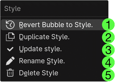
To the right is a menu button "..." ![]() which opens a menu for you to manage the selected style.
which opens a menu for you to manage the selected style.

For builtin styles only the first two options will be enabled.
 Remove all changes to this bubble that differ from the selected style.
 Duplicate this style. You will be prompted to give the new style a name. All settings from the current style will be added to the new style as well as any changes from that style that are present in the bubble.
 Update the style from the current bubble settings. (Only enabled for user-created styles.)
 Rename the style. (Only enabled for user-created styles.)
 Delete the style. All bubbles using this style will revert to the Default Style. (Only enabled for user-created styles.)

When you open the style panel you will see a lot of settings. Fortunately they are grouped together according to the part of the bubble they affect.
Items with the cross-in-circle icon to the right of the setting have values that differ from the selected style. You can revert those settings to the style value by clicking on the icon.
Icon Settings
![]() The first group controls the size and tint of the icon.
- You can rotate the icon from -180 to +180 degrees, you might want to do this to make a horizontal icon vertical, or to build a visual map of a rig with bone icons mirroring the orientation of bones.
- The icon can be scaled as a percentage of the bubble size. 1.00 means the icon will cover the same area as a square drawn around the bubble. Note that most icons have some border space so 1.00 might seem a little smaller. You can scale the icon from 0.0 to 2.0. At sizes larger than 1.0 most icons will overlap adjacent bubbles.
- The icon can be offset vertically as a proportion of it's scaled size. Positive values move it up, Negative values move it down. This is primarily of use to make the icon and the text fit nicely in the bubble.
- Icon Tint lets you choose a colour to mix with the icon. Many icons are white so this effectively changes the icon colour. For icons that are not pure white, the tint will be mixed with the existing icon colours. The opacity field to the right of the colour swatch sets the opacity of the icon.
The first group controls the size and tint of the icon.
- You can rotate the icon from -180 to +180 degrees, you might want to do this to make a horizontal icon vertical, or to build a visual map of a rig with bone icons mirroring the orientation of bones.
- The icon can be scaled as a percentage of the bubble size. 1.00 means the icon will cover the same area as a square drawn around the bubble. Note that most icons have some border space so 1.00 might seem a little smaller. You can scale the icon from 0.0 to 2.0. At sizes larger than 1.0 most icons will overlap adjacent bubbles.
- The icon can be offset vertically as a proportion of it's scaled size. Positive values move it up, Negative values move it down. This is primarily of use to make the icon and the text fit nicely in the bubble.
- Icon Tint lets you choose a colour to mix with the icon. Many icons are white so this effectively changes the icon colour. For icons that are not pure white, the tint will be mixed with the existing icon colours. The opacity field to the right of the colour swatch sets the opacity of the icon.
Text Settings
![]() The second group of controls affects the icon title text. If the text is not set in the Item section at the bottom of the dialog, its content will depend on the action selected. Enumeration and value settings may present the text or numerical value. See Item Panel for more details.
The second group of controls affects the icon title text. If the text is not set in the Item section at the bottom of the dialog, its content will depend on the action selected. Enumeration and value settings may present the text or numerical value. See Item Panel for more details.
- Set the text colour and opacity
- Change the text size.
- Change the text offset. If the icon offset is positive, a negative text offset can help both be seen more clearly.
Bubble Colours
![]() In this section you can set four different bubble background colours
In this section you can set four different bubble background colours
- Bubble Colour sets the background of the bubble when not modified by any other status.
- Highlight sets the colour of the bubble when hovered in Nearest or Radial bubbles. Releasing the foam's activation key while a bubble is highlighted will activate it and close the foam.
- Active sets the colour of a toggle bubble when its corresponding setting is on.
- Disabled sets the colour of a bubble that is disabled. This is usually because the setting is not available with the current Blender selection.
Clicking on these colour swatches will open the standard Blender colour picker panel. You can take advantage of this to copy the hex colour value if you want to apply the same colour to multiple bubbles.
Bubble Radius
![]() The Radius control presents several preset button radius choices. Click on the custom slider button at the right of the choices to set a custom radius. The interface will change to add a radius slider below the preset choices.
The Radius control presents several preset button radius choices. Click on the custom slider button at the right of the choices to set a custom radius. The interface will change to add a radius slider below the preset choices.
Gauge Settings
![]() For single value numeric settings you can set the colour of the gauge and the width. The gauge will draw a line around the outside of the bubble. High values for Gauge Width will allow you to make bubbles that look like single-valued pie charts.
For single value numeric settings you can set the colour of the gauge and the width. The gauge will draw a line around the outside of the bubble. High values for Gauge Width will allow you to make bubbles that look like single-valued pie charts.
This section shows settings that are not valid for all bubbles. If the setting is not used in the current bubble, it will show a closed-eye symbol to the right.